Created Mar 2022
MEDIA
BRANDING & LOGOS
SAP Canada Comeback Campaign - National Branding Campaign
Project Context
As SAP Canada offices reopened, the Managing Director team’s objective was to build excitement and create opportunities to bring people together. The overall goal of the return to office campaign was to increase employees’ excitement and anticipation of the expected full re-opening of the SAP Labs locations across Canada.
As the project and design lead of this project, my final deliverable was to create an overall arching brand that will link the multiple events, perks and reopening communications; all of which would roll over the first 6 months of re-opening the SAP Canadian offices.
Methods & Tools
Adobe Suite – mainly Illustrator and Photoshop
Mural
PowerPoint
Campaign Objectives
Get employees, contractors and interns excited about going back to the office
Increase awareness about future in-office events in a safe way respecting event guidelines
Create digestible and fun communications
Model flex work (be inclusive to those at working home and/or those coming into the office)
Design Process
Definition and Planning
Each of the four brands had a different name, theme, logo, logotype, banner, colour scheme and potential options for incorporating it into the events.
Due to the scale of this project and the many design assets that would need to be created, I first built a timeline of the project. This implementation plan included the deadlines and the stakeholders needed to gain feedback on the brand before I could translate the design into further assets such as digital signage, posters and even photobooth assets.
Brand Ideation and Conception Phase
To ideate, I started with building mind maps and then categorized my top ideas to match different themes, which resulted in the top four directions for the campaign. Next, I created a mood board using Mural which I used to present four different branding directions in which to take this campaign to Cindy Fagen, the Managing Director of SAP Labs Canada and Maria, the Lead of Internal Events for SAP Canada. As shown, each brand had a different name, theme, logo, logotype, banner, colour scheme and potential options for incorporating it into the events. We finalized our decision to make SAP Canada’s Comeback the brand for the campaign. SAP Canada was making their comeback by giving employees the option to return to the physical offices. The campaign theme needed to reflect this fun, action-packed message and the theme best suited for this was a superhero theme.
SAP Comeback Logo - used for photobooth props
Design Development & Revisions
Logo Development
The initial idea behind the logo was to make it look like an explosion in a comic book that goes “bang” or “kapow”. There are usually stars or diamonds however, I changed these to maple leaves to reflect SAP Canada. The logotype is a royalty-free logotype that I found on dafont.com. The blue and gold colouring are SAP-branded colours.
SAP Comeback Banner - used for newsletters, PPT slides, newsletters and digital signage.
Banner Development
The banner was used in multiple marketing assets for Waterloo, Montreal, Vancouver, Toronto, Ottawa and Calgary offices.
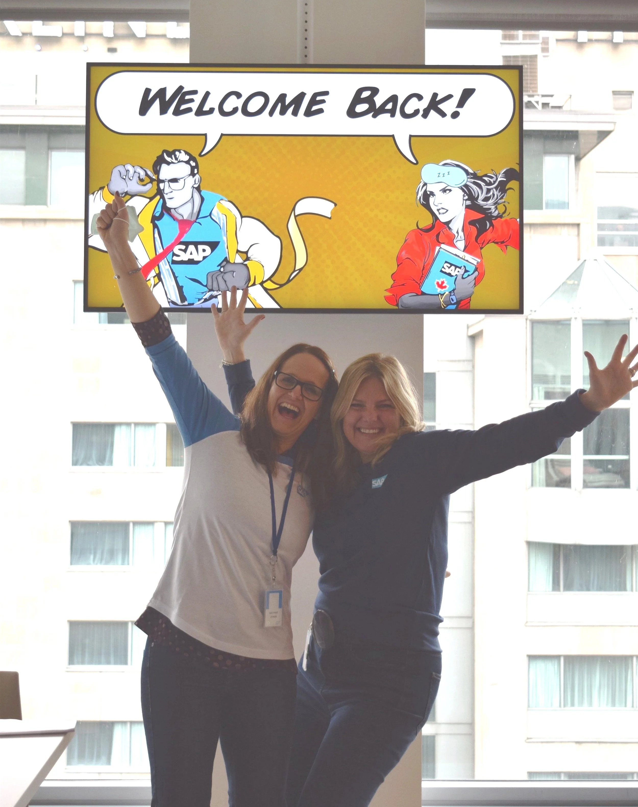
The idea was to create the action as if a superhero was ripping off their pjs or sweats (from working at home) into theirs work clothes to go back to the office. Additionally, the banner needed to symbolize hybrid/flex work so I drew the characters to wear both PJs and work clothes.
The male superhero has light blue striped PJs, a cream robe and sweats covering his blue SAP work shirt. While the woman is wearing an eye mask, and a red work shirt, on her book is a picture of the SAP logo & maple leaf sticker. Also, SAP-branded colours are incorporated into the banner.
Design Deployment
After final approval was made of my designs, the next step was resizing and redesigning these assets to be used in the following:
Banner for monthly managing director newsletter to give employees sneak peek of the office reopening campaign.
Newsletter banners
Slack & newsletter blurbs
PowerPoint slides for virtual events talking about re-opening
Digital Signage (the TVs in the office)
Printed posters for the office reopening
Photobooth assets
Project reflection
I spent four months working from home and being onboarded virtually during COVID-19. When I went into the Vancouver office for the first time during SAP’s full reopening, I finally saw my designs in-person on the TVs. It’s exhilarating to watch your ideas come to life in the form of a finished product. Listening to the positive feedback from my co-workers and team, I am very proud of being the first one to warmly welcome back all SAP Canadian employees who are coming back into the office.
Dakota Jaggs, digital Signage at the SAP Labs Vancouver Office
Cindy Fagen, Managing Director of SAP Labs Canada & Agnes Garaba, Chief Operating Officer of SAP Labs Canada
Digital Signage at the SAP Labs Montreal Office


